Blog
CodeAspire > Blog > How to Use Animations in Your Mobile Application For Better

- CodeAspire
- Jan 14, 2021
How to Use Animations in Your Mobile Application For Better
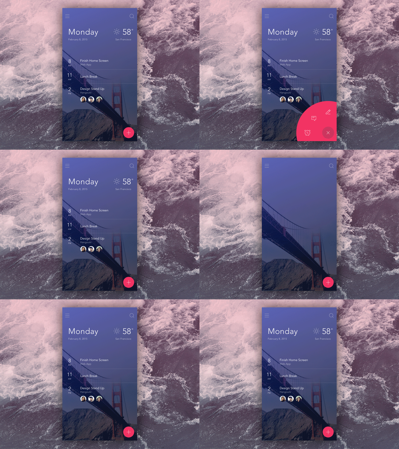
In the mobile interface, great mobile app animation seems natural to users and works for the good of the app's UX. Interface animations in mobile applications can quickly react to users' interactions, help users navigate, or simply engage users. In this article, we dig into eight types of mobile app animations and explore how they enhance the user experience.
a. Splash screen animations
A splash screen is a screen that a user sees right after opening an app. Typically, it contains the logo of the company or app. Users expect apps to load immediately, but with complex mobile applications, this is not always possible. As the splash screen has no functional elements, it only serves as entertainment. Splash screen animations can distract users and make the load time shorter than this. Furthermore, your splash screen makes the first impression after the user downloads your app.
The perfect splash screen animation:
1–3 seconds long
2. fluid
3. informs users that the app is loading and working
4. Engages users and gets their attention
5. Makes an app look like it’s running fast etc
The animated element provides a seamless loading experience, making it appear that the splash screen is not even present.
b. Feedback animations
A response animation tells users that they are on the right track and that an action has been successful or failed. The major thing is to show the user that the app responds to their actions so that they do not ask themselves, have I pressed the OK button? Feedback animations make the user's journey comfortable and make the user experience positive. You can achieve a great UX with the help of animated pop-up notifications, buttons and ticks, color and size changes, field backlights, and more like
Some feedback animation are:
1. is obvious and clear to all users
2. imitates the interaction between the user and the device
3. is visual, with as little text as possible etc.
c. Onboarding animations
When a user downloads your app, they speculate that UX will be intuitive or show them at least some hints on how to navigate. Customers must to see pop-up instructions on how to use the main features of your app. You should use the onboarding step to make a good impression that will persuade users to use your app. It is important to demonstrate how convenient your app is initially.
Some major onboarding animations are:
1. provides a quick tour of the app
2. highlights the app’s main features
3. shows how to use the app and what to do next
4. is easy to understand
This excellent onboarding animation incorporates pure design with an extensive walkthrough. The transition is natural and shows how the components of the app interact. The animation highlights the main features of the app with a brief description, giving an onboarding scene and telling a story. The application uses familiar icons that make walkthroughs instantly understandable.
d. Navigation animations
At least the trend has given rise to plain designs that hide almost all navigation elements. A lot of apps have a complex hierarchy that users do not see. You can present hidden elements with the help of mobile application animations. The way you organize those elements in animation can make even the most complex in-app navigation clear and make the UI intuitive. By animating key elements, you can show users where they will find the features they need.
Major navigation animation's are:
1.transports users between the navigational context smoothly
2. facilitates transitions inside the app
3. uses familiar icons rather than text
e. Animated progress indicator
It is common that some apps take some time. While the application is connecting to the server or performing other time-consuming activities, it may appear that it is stuck. To avoid this, it is a good idea to use progress status animation, so that the user can see that the app is running. Users are familiar with such animations; They usually see them when a file is being downloaded or data is being processed. With the help of Pragati Animation, you will inform your users that the app is running smoothly and how long they need to wait.
Major Progress Indicator's are:
1. Notifies users of progress
2. They wait while entertaining or calming users
3. Is original and has a high probability of becoming a viral feature, such as offline dinosaurs in Google Chrome
An important principle in UX design is informing your users about the state of the system. If you can't reduce the waiting time, make it fun for your users to wait. This animation hits all targets.
Recent Post

What are the benefits of google adsense?
Dec 22, 2023
What is the future of game development companies?
Dec 18, 2023

